Carousel
Demos
Switching items
Use the index to control the current item to be displayed.
Index

<template>
<article>
<section>
<h4>Index</h4>
<veui-number-input
v-model="index"
:min="0"
:max="items.length - 1"
/>
</section>
<section>
<veui-carousel
:datasource="items"
:index.sync="index"
/>
</section>
</article>
</template>
<script>
import { Carousel, NumberInput } from 'veui'
export default {
components: {
'veui-carousel': Carousel,
'veui-number-input': NumberInput
},
data () {
return {
items: [
{
src:
'https://ecmb.bdimg.com/public01/one-design/2b77cc4a4c5c906993c0e512f3ddaf03.jpg',
alt: 'A cute kitty looking at you with its greenish eyes.',
label: 'Cat'
},
{
src:
'https://ecmb.bdimg.com/public01/one-design/6fedc62b9221846ce5114c7447622e47.jpeg',
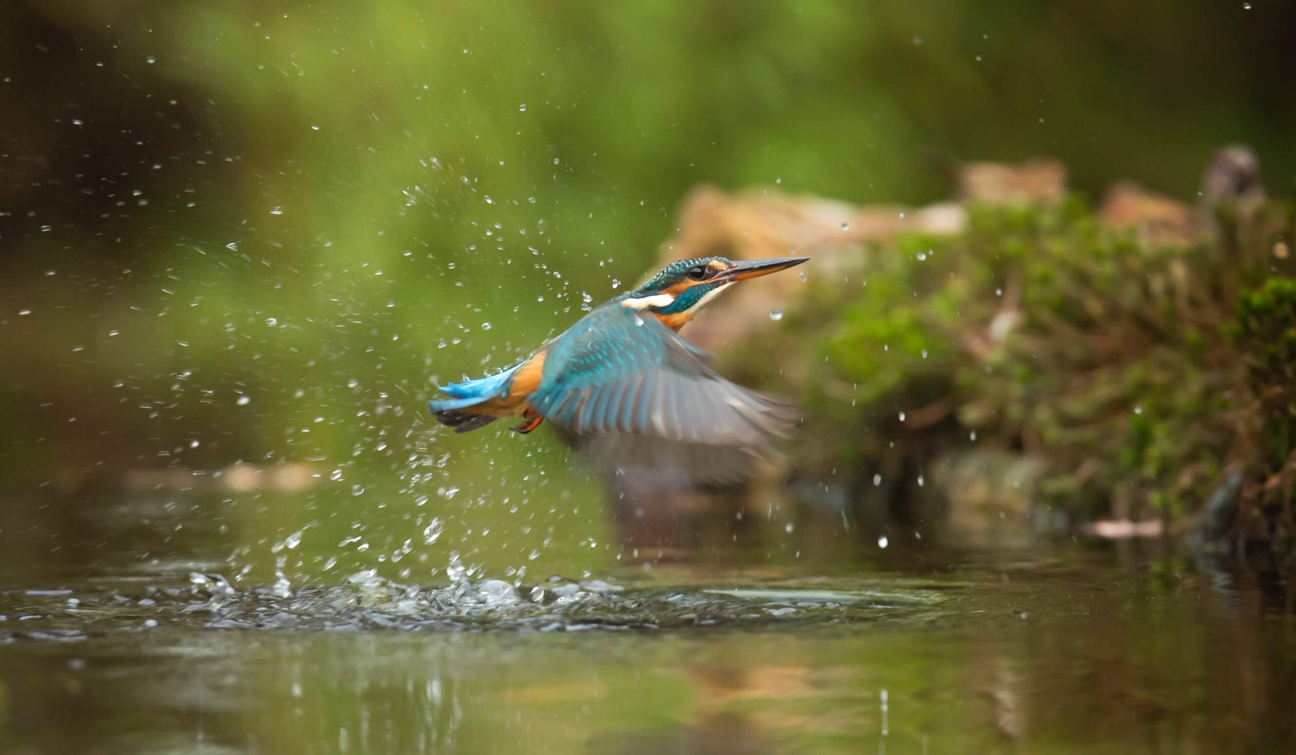
alt: 'A common kingfisher flying above river.',
label: 'Kingfisher'
},
{
src:
'https://ecmb.bdimg.com/public01/one-design/e1b6473c898d9e456452ee79d7533a86.jpeg',
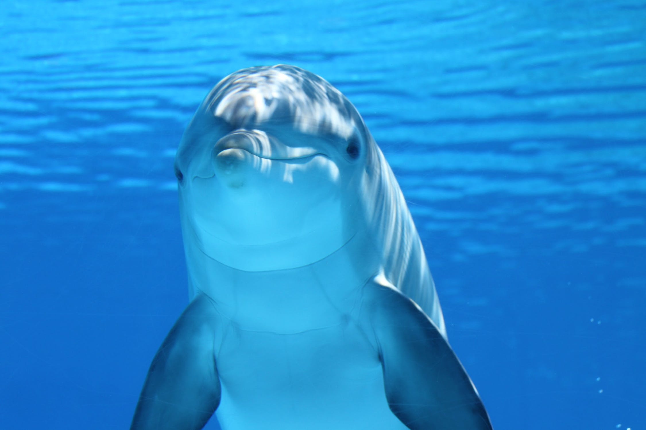
alt: 'A white and gray dolphin in blue water.',
label: 'Dolphin'
}
],
index: 0
}
}
}
</script>
<style lang="less" scoped>
h4 {
margin: 0 0 10px;
}
section {
margin-bottom: 10px;
}
</style>
Indicator type
Use the indicator prop to specify the type of step indicators.
Indicator type
Indicator position(仅在对齐方式是 end 时生效)
Indicator align
<template>
<article>
  <section>
    <h4>Indicator type</h4>
    <veui-radio-group
      v-model="indicator"
      :items="indicators"
    />
    <h4>Indicator position(仅在对齐方式是 end 时生效)</h4>
    <veui-radio-group
      v-model="indicatorPosition"
      :items="positions"
    />
    <h4>Indicator align</h4>
    <veui-radio-group
      v-model="align"
      :items="alignments"
    />
  </section>
  <section>
    <veui-carousel
      :datasource="items"
      :indicator="indicator"
      :indicator-position="indicatorPosition"
      :indicator-align="align"
    />
  </section>
</article>
</template>

<script>
import { Carousel, RadioGroup } from 'veui'

export default {
  components: {
    'veui-carousel': Carousel,
    'veui-radio-group': RadioGroup
  },
  data () {
    return {
      items: [
        {
          src:
            'https://ecmb.bdimg.com/public01/one-design/2b77cc4a4c5c906993c0e512f3ddaf03.jpg',
          alt: 'A cute kitty looking at you with its greenish eyes.',
          label: 'Cat'
        },
        {
          src:
            'https://ecmb.bdimg.com/public01/one-design/6fedc62b9221846ce5114c7447622e47.jpeg',
          alt: 'A common kingfisher flying above river.',
          label: 'Kingfisher'
        },
        {
          src:
            'https://ecmb.bdimg.com/public01/one-design/e1b6473c898d9e456452ee79d7533a86.jpeg',
          alt: 'A white and gray dolphin in blue water.',
          label: 'Dolphin'
        }
      ],
      indicator: 'bar',
      indicatorPosition: 'inside',
      align: 'start',
      indicators: [
        { label: 'bar', value: 'bar' },
        { label: 'number', value: 'number' },
        { label: 'dot', value: 'dot' },
        { label: 'none', value: 'none' }
      ],
      alignments: [
        { label: 'start', value: 'start' },
        { label: 'end', value: 'end' }
      ],
      positions: [
        { label: 'inside', value: 'inside' },
        { label: 'outside', value: 'outside' }
      ]
    }
  }
}
</script>

<style lang="less" scoped>
h4 {
  margin: 0 0 10px;

  &:not(:first-child) {
    margin-top: 10px;
  }
}

section {
  margin-bottom: 10px;
}
</style>
Autoplay
Use the autoplay prop to enable autoplay.
You can also use the autoplay prop to enable autoplay, use the wrap prop to enable looping and use the pause-on-hover prop to pause playing when cursor hover step indicators.
<template>
<article>
  <veui-carousel
    :datasource="items"
    autoplay
    pause-on-hover
    :interval="5000"
  />
</article>
</template>

<script>
import { Carousel } from 'veui'

export default {
  components: {
    'veui-carousel': Carousel
  },
  data () {
    return {
      items: [
        {
          src:
            'https://ecmb.bdimg.com/public01/one-design/2b77cc4a4c5c906993c0e512f3ddaf03.jpg',
          alt: 'A cute kitty looking at you with its greenish eyes.',
          label: 'Cat'
        },
        {
          src:
            'https://ecmb.bdimg.com/public01/one-design/6fedc62b9221846ce5114c7447622e47.jpeg',
          alt: 'A common kingfisher flying above river.',
          label: 'Kingfisher'
        },
        {
          src:
            'https://ecmb.bdimg.com/public01/one-design/e1b6473c898d9e456452ee79d7533a86.jpeg',
          alt: 'A white and gray dolphin in blue water.',
          label: 'Dolphin'
        }
      ],
      autoplay: true,
      pauseOnHover: true
    }
  }
}
</script>
API
Props
| Name | Type | Default | Description | ||||||||||||
|---|---|---|---|---|---|---|---|---|---|---|---|---|---|---|---|
datasource | Array<Object> | [] | The media datasource for the carousel, with the item type being
| ||||||||||||
index | number= | 0 |
The index of the current image within the datasource. | ||||||||||||
indicator | string= | 'radio' | The way the indicator is displayed.
| ||||||||||||
switch-trigger | string= | 'click' | The behavior triggers item switch when radio indicator is displayed.
| ||||||||||||
autoplay | boolean= | false | Whether to autoplay the carousel. | ||||||||||||
pause-on-hover | boolean= | false | Whether to pause the cycling on hover when autoplaying. | ||||||||||||
interval | number= | 3000 | The amount of time to delay between automatically cycling an item. | ||||||||||||
wrap | boolean= | false | Whether the carousel should cycle continuously or have hard stops. |
Slots
| Name | Description |
|---|---|
item | The content of each carousel item. Displays the corresponding image by default. The slot scope properties are the same as each item inside |
Events
| Name | Description |
|---|---|
change | Triggered the current item changed. The callback argument list is |
Icons
| Name | Description |
|---|---|
prev | Previous item. |
next | Next item. |